![]()
![]()
Tutorial Page 5
![]()
A progress bar will now appear. The simulation will probably take around 30 to 40 seconds, depending on the speed of your computer. When this is complete, click "OK", ensuring the "Launch results file" box is checked. This should launch Excel and open the workbook just created. We'll now look at its contents.
The first worksheet in the book is called "Title". This lists the name of the mode, the data and time it was run, and the contents of the parameters and environment files selected. This provides a complete definition of the simulation.
The next worksheet is called "Environment". This contains time values in column A and corresponding values for white light in column C. Column B contains the ZT time of each time value. In column E is a list of all the ZT0s that occurred.. These should be 0, 24, 48, 72 and 96 as white light was set to come on at time zero each day. Next to this is a table of on and off times for white light.
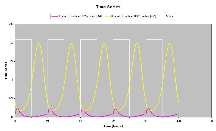
Next is a chart of the time series values of the two selected proteins and the light-dark cycle. It should look something like this.
The White light values are plotted on a secondary axis which is not shown, so the graph displays the relative changing values not the absolute values.
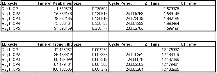
The next worksheet is called "cLn", as this is the shortened name for nuclear LHY protein used in the model. This contains time values, ZT times and protein levels in columns A to C. Next to this are tables of analysis for peak times and trough times that will look something like this.
The column "LDCycle" shows which day each peak or trough fell in. Cycle period at each peak or trough is measured by taking the difference between this peak or trough and the previous one. Even when the model is properly entrained, cycle period is never exactly the same as the period of the entraining cycle due to numerical error in the equation solvers. ZT time is simply the difference between the peak or trough time and the previous ZT0. CT time is calculated only in periods of constant conditions, so does not apply to this simulation. If you click on these cells you will see that they are all Excel formulae so it is obvious exactly how each value was calculated. The idea of this is that users are free to alter these formulae if they don't agree with our methods of analysis.
The next worksheet is called "cTn" and contains the same data for TOC1 protein. However, we elected to integrate this output against the light-dark cycle so it contains an additional table of integration values which will look like this.
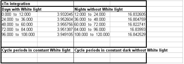
As you can see, there are sets of values for both days and nights. These are the measured areas under the curve for the corresponding time blocks. TOC1 is expressed predominantly at night, hence these values are much larger. The sections for constant conditions would be filled if there had been a period of DD or LL in the environment file. In this case time blocks would have been created based on the free running cycle period.
Below this table is a list of the actual values used for integration, and a chart of these values. The white markers on the chart indicate the boundaries of each time block. This chart doe not actually tell us much as its values are just the time series values for TOC1, but if you integrate the coincidence between two or more outputs then it can be very useful to visualise the actual values used.
If you click on the "Results" tab of the file browser, you will see that the new workbook has appeared here. It can be opened from here by double clicking at any time in the future.
Now we are familiar with the basic operation we'll now simulate one of the most popular circadian experiments, a phase response curve.