![]()
![]()
Tutorial Page 11
![]()
The simulation will probably take a minute or two, depending on the speed of your computer. When this is complete, launch the results workbook.
The first worksheet in the book is again called "Title". This will list the contents of all the files used for each of the runs.
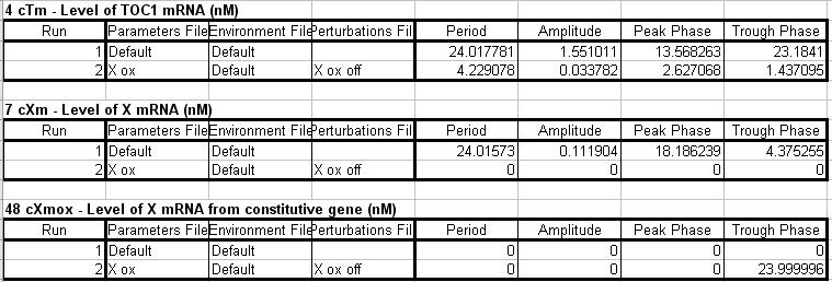
The next worksheet is called "Summary Data". This contains three tables, one for each output. comparing how various aspects the output vary between runs.
As you can see, the effect of varying the input files on period, amplitude, peak and trough phase are all shown. There is no integration this time as we did not select this option. Again these values represent the values for the final cycle period for each run, and these values are all Excel formulae.
You can see that the data for level of X mRNA from constitutive gene is meaningless. This is because this output does not oscillate. The same applies to level of X mRNA on run 2 as this native gene is knocked out.
Next is a sheet called "Summary Charts" which contains plots of this data, one row of graphs for each output. These do not really show very much this time, but we are not really interested in this. In this experiment we are more interested in the time series.
The next worksheet is called "Environment 1". This contains all the light values for the first run of the simulation.
The next worksheet is called "cXmox, Run 1". This contains the time series values for X mRNA from the constitutive gene. This was not switched on on the first run so consists of all zeros.
Next is a worksheet called "cXm, Run 1". This contains the time series values for X mRNA from the native gene in run 1, the wild type experiment. Similarly there is a worksheet called "cTm, Run 1" for TOC1 mRNA from run1.
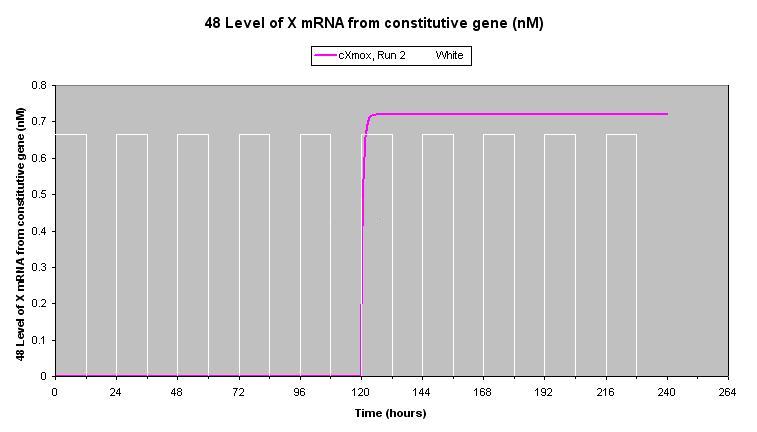
Now come the worksheets for the second run, the mutation. "Environment 2" is the same as "Environment 1" as the same environment file was used in both runs. "cXmox, Run 2" shows how the level of mRNA from the over-expressor gene is zero for the first 120 hours, and then rises rapidly when the gene is switched on, and levels off as degradation equals production. The embedded chart should look like this.
"cXm, Run 2" is the level of X mRNA from the native gene. This is all zeros as this gene is knocked out by the mutation.
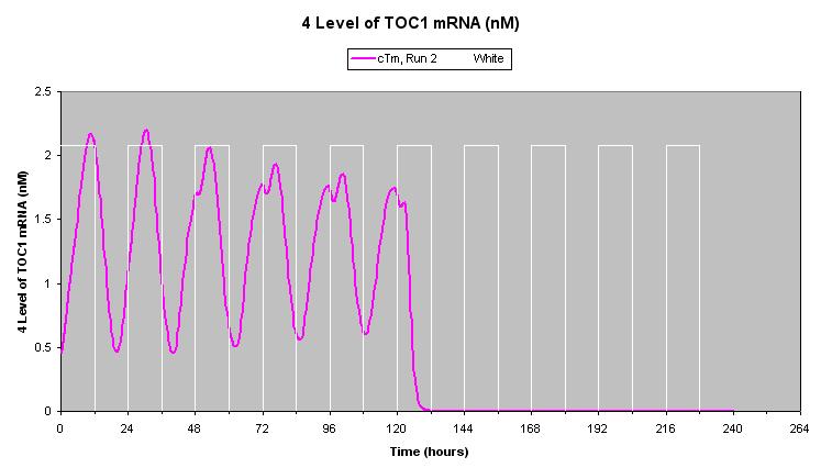
"cTm, Run 2" is the level of TOC1 mRNA. This shows a distorted time series that is damping for the first 120 hours. This is is due to the knockout of the X gene. However, when the constitutive X gene is switched on, TOC1 levels falls rapidly to zero.
Next is a chart called "Chart - Perturbations Run 2". Whenever a perturbation is applied to a model parameter, in this case the level of expression of the constitutive gene, n4ox, a chart will be plotted of its changing value alongside the environment cycle. This is just to confirm that its value changed during the simulation in the way that was intended. It can be seen that its value switched from zero to one at 120 hours as we intended. The next worksheet just contains the source data for this chart.
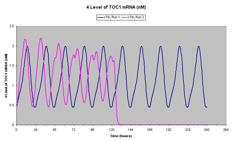
At the end of the book there are three charts, one for each output. These are plots of the time series for both runs on the same axes. For example, the plot for TOC1 mRNA is show below.
Blue is the wild type, and purple the mutation. The distortion of the level of TOC1 due to the X gene knockout can be clearly seen. It is apparent here that the period of the oscillation is reduced by the mutation.
The chart for X mRNA from the native gene simply shows the level being zero for the second run, and the chart for X mRNA from the constitutive gene shows that an initial level of zero rises rapidly at 120 hours and levels off on the second run, whilst remaining flat on the first.
That concludes this experiment. For our final tutorial we will take another look at perturbations, look at creating a more complex environment, and see how flexible Circadian Modelling can be.