![]()
![]()
Tutorial Page 7
![]()
A progress bar will now appear. The simulation may take a minute or two to run the multiple simulations, depending on the speed of your computer. When this is complete, launch the results workbook.
The first worksheet in the book is again called "Title". This will be the same as before, except that information on the light pulse used to generate the PRC is included at the end.
The next worksheet is again "Environment". Note here that after the end of the 120 hours defined in our environment file, as requested, another 100 hours has been appended, with light having a value of zero through out this period. This is because this environment refers to the control run with no light pulse.
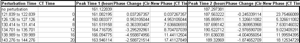
Next is a sheets called "PRC Data". This contains the table below.
This table displays the actual times of each light pulse, and their CT times. There are then blocks of data for two peak times. This is because we opted to append 100 hours over which to measure phase, and there were two suitable peaks found in this period in the control run. The top row of data shows these two times, 161.1 hours, and 187.3 hours. Below each of these are the times of the peak closest to the control in each of the runs with the light pulses. Phase change is calculated by subtracting these times from the control peak time and multiplying the result by 24 divided by the free running cycle period of the control run, in order to convert absolute hours to circadian hours. This method results in phase advances giving positive changes and phase delays giving negative changes, as is the convention in circadian biology. New phase is simply the phase change added to the CT time of the pulse. Modulo 24 is applied to this to ensure all values are in the appropriate range of zero to less than 24. Again all values are Excel formulae so the exact calculations used can be seen.
Below this table are a series of time series plots of each pulsed run plotted alongside the pulse and the control run.
Next comes a chart called "Phase Shifts". This is a plot of phase change versus peak number, with a series for each pulse time. This would be useful if you were interested in tracking how long it takes for the model to reach a new stable phase after the light pulse.
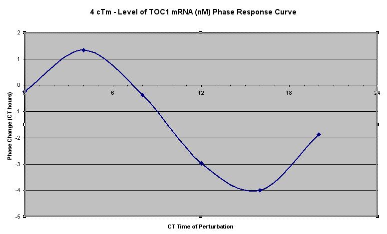
Next you will see the actual phase response curve and the phase transition curve, which are plots of phase change versus CT time of pulse and new phase versus old phase respectively. Each of these is plotted using the last suitable peak in the control run, which in this case is peak two. The PRC should look like this.
Next there is a worksheet called "cTm, no perturbation". This contains time series values, analysis of peak times and an embedded chart for the control run. Note that this time there are values present for CT time for the DD period from 120 to 220 hours. CT time is measured by extrapolating the last ZT0 time forward, using the free running cycle period, to just before the peak in question, and converting the time difference to circadian hours. Again this is an Excel formulae, which you can alter if you don't agree with our calculations.
After this come a series of sheets of time series values for the runs with the different light pulses. These only cover the period from the first light pulse onwards, as prior to this they are all identical to the control run. Light values appear alongside the mRNA levels, showing just where the pulses occurred.
Circadian modelling also allows the production of PRCs with differing sizes of perturbation, and 3D PRCs where both time and size are varied. Next though we will look at another common circadian experiment, a fluence response experiment.