![]()
![]()
Visualisation Tools - screenshots
![]()
The visualisation tools will plot simple timeseries in 1-D (below), 2-D and 3-D, and also show animated network diagrams.
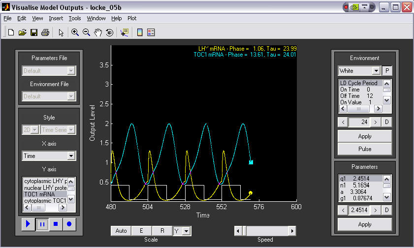
1. A simple time series plot.
This example shows LHY and TOC1 mRNAs oscillating in antiphase under L:D 12:12 conditions. Components to plot are selected from the left panel. Parameters and Environment can be altered on the right.
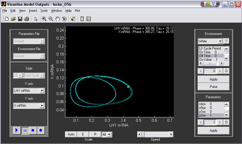
2. 2-D phase plane plot, demonstrating an experimental manipulation.
LHY mRNA is plotted against X mRNA in DD conditions. The user switches on a constitutive TOC1 over-expressor gene during the simulation(bottom right, p2ox changed from 0 to 1). The initial 'wild-type' limit cycle (left circle) is shifted to the right, indicating that the amount of LHY increases due to TOC1 overexpression.
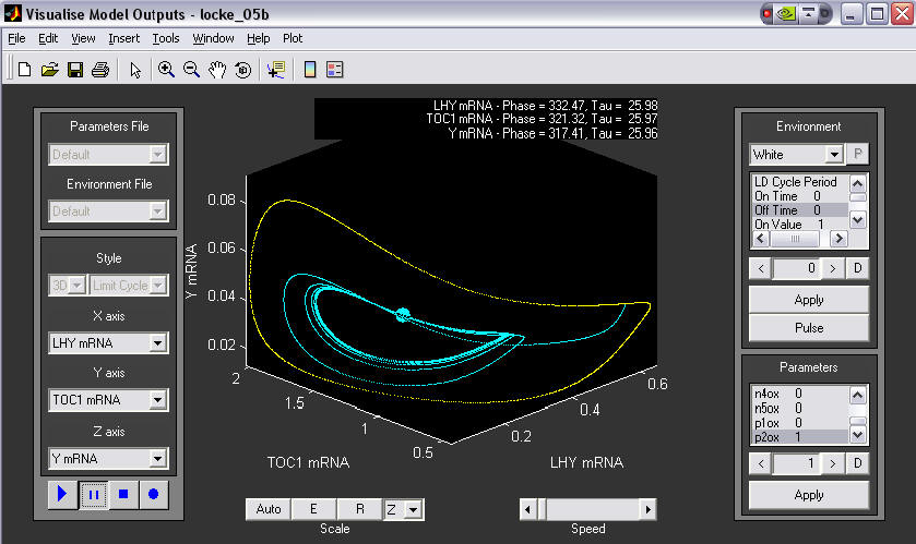
3. A 3-D phase plane plot, showing a change in environment.
An initial 3D limit cycle in LL is shown in yellow. The user then changed to DD, causing the plot to change to blue. After a few cycles a new stable limit cycle was found.
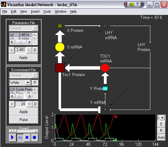
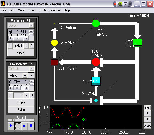
The sizes of the markers are proportional to the levels of the species they represent, and the thickness of the arrows proportional to the strengths of interactions between species. mRNAs are circles, proteins are squares. The corresponding time series is shown below, LHY in green and TOC1 in red. This image was taken just after dusk and shows which parts of the network are the most active during the dark phase.
5. Animated network diagram with light pulse.
This time the system is oscillating in DD, but the user has just applied a light pulse. This shows the parts of the network which are most affected by this. LHY is rapidly produced, inhibiting TOC1 transcription, which is at its peak.